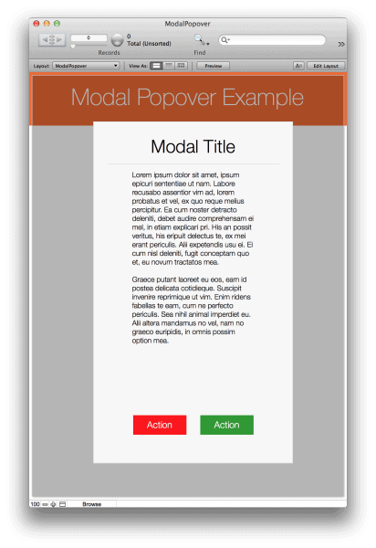
Today we’ll be exploring the concept of using popovers as modal dialogs in FileMaker.
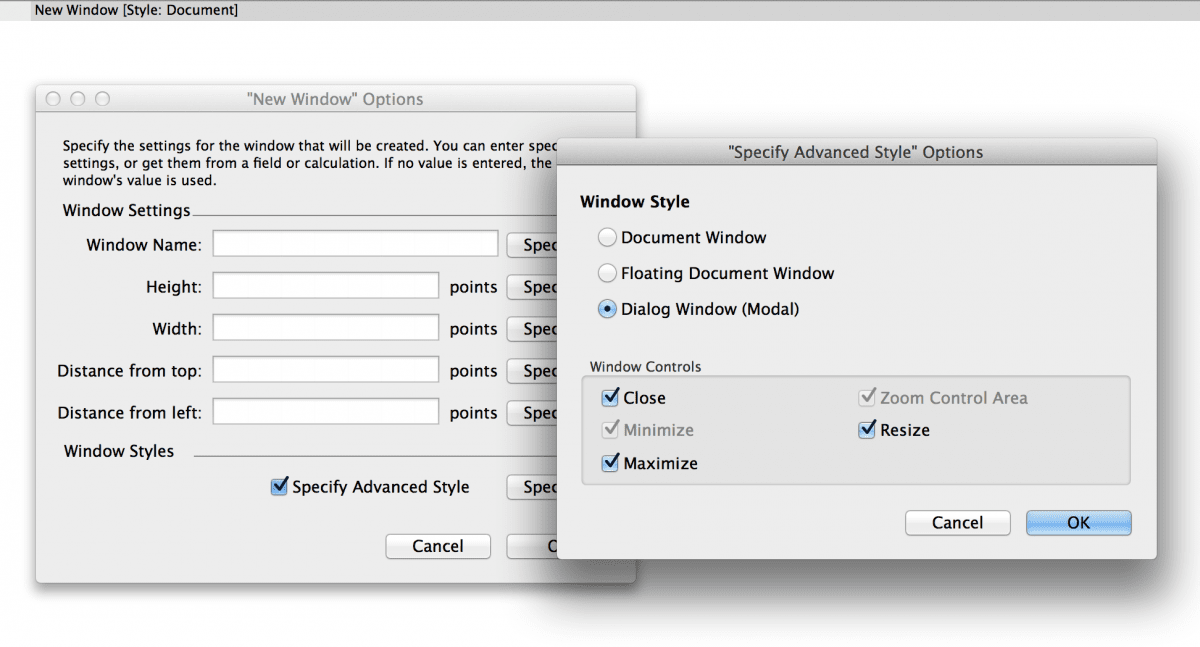
A modal dialog is a type of control that forces the end user to look at something or take action before continuing. FileMaker has had this functionality with the advanced window styles for a while now, but many users find that opening a new window is frequently undesirable. This is especially true in Windows environments, where new windows don’t behave as nicely as they do on OS X.
A preferable control, one that’s been used on the Web for years, is to overlay your dialog box on top of the existing page. It feels less like you’re breaking from your existing context, and you don’t run into the issues that might occur when opening a completely new window. For the purposes of this exercise, we’ll focus on the styling to get things looking good!
*For additional information on how to avoid the common nuisance of popovers closing when clicking outside the box, David Thorp at Excelisys writes a very informative article.*
Building the popover
We’ll start by building out the popover itself. Select it from the status tool bar and draw the popover button on your layout.

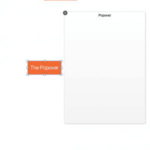
 Once you’ve got that on the layout, double clicking it in layout mode will bring up the popover itself.
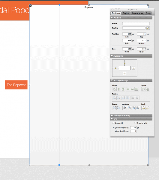
This is what we’re primarily going to be editing. Popovers have an interesting property in that they can be larger than the layout itself, and FileMaker will go with it and have it fill out the layout completely.
Resizing the popover & adjusting the fill color
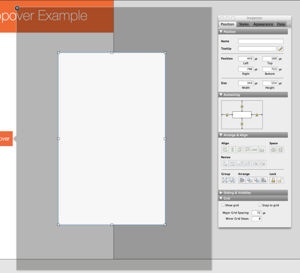
That’s exactly what we’ll do here to get our desired effect. Select the popover and set its width and height to be greater than the total width and height of the entire layout.
This works great until you resize the window. You’ll notice that the popover doesn’t continue to fill the window, and that’s expected. Right now, the popover is locked to the left and top edges of the window for auto-sizing purposes—this means it won’t resize once we resize the window. We actually need to lock it to all four edges of the window.

Note that I also opted not to show a title on the popover, as that would interfere with our effect. You can get this dialog by double clicking on the popover.

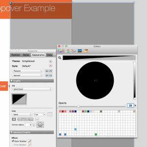
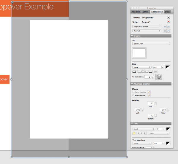
Now we’ll change the fill color of this popover to a solid black with an opacity level of 29 percent. This will give us the transparent background we’re looking for.
Adding content
Next up is the content. There’s a couple of ways to do this. I’ll touch on the first one, but note that it’s not the best way. It involves adding a substantial amount of padding (all sides) to the popover style, and then giving the Popover: Content style a white (or other color) fill.
 This achieves the effect of a transparent background with a place to put your content but it doesn’t deal well with varying window sizes. At a certain point, the interior of the popover becomes scrollable which may confuse some users. It’s probably best to stay away from this one unless you can guarantee a window size.
The preferable and simpler method is to place a rectangle right on top of the popover panel, set its fill color to whatever you want and enable all four edges for auto-sizing just as you had done for the popover itself.
From there, you can add any content you want within that rectangle. Just make sure to pay attention to the auto-sizing settings of those objects.
Removing the animation
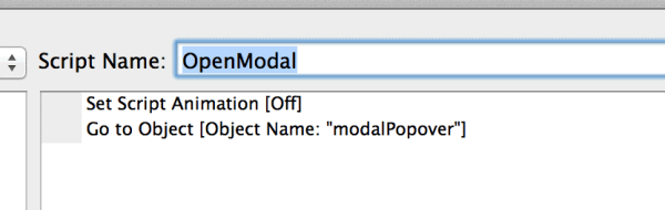
One final item to consider is the animation that occurs when you open this dialog. The default behavior of a popover is to use a neat little animation when it’s opened. For most cases of popovers, this can be a really nice effect, but it can be a little distracting in this scenario. Luckily, FileMaker gives us a way to programmatically open popovers and disable the animation feature.
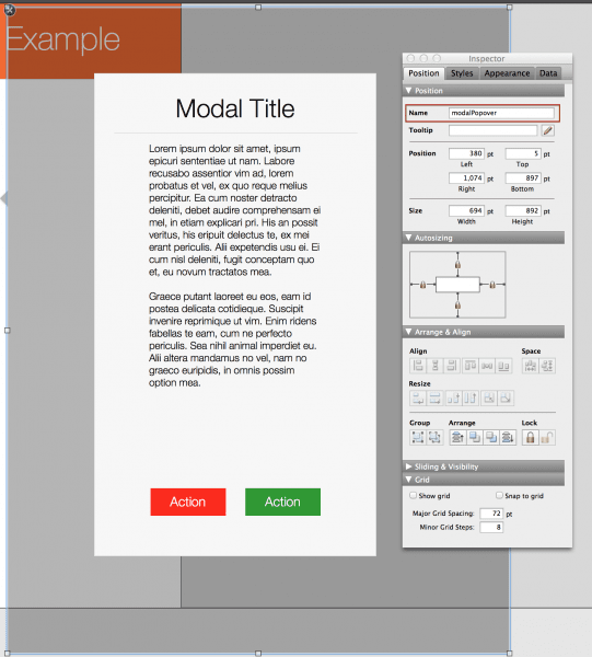
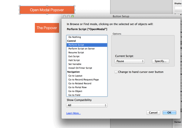
To disable the feature, select the popover and give it a name (shown left). In this case, we’ll keep it generic and call it modalPopover, but you’ll probably want to be a little more specific in your real world usage.
Creating the script
Giving it a name allows us to refer to this specific popover directly within a script. From here, we’ll create this script:
Then, we create a new button to call that script (below).
But now we have two separate ways to get to the same place with slightly different behaviors. Not good, right? We can fix this pretty easily with the Hide object when feature. Select your popover button, switch over to the data tab of your inspector and enter a 1 under the Hide object when section. You’ll also want to enable Apply in Find mode.
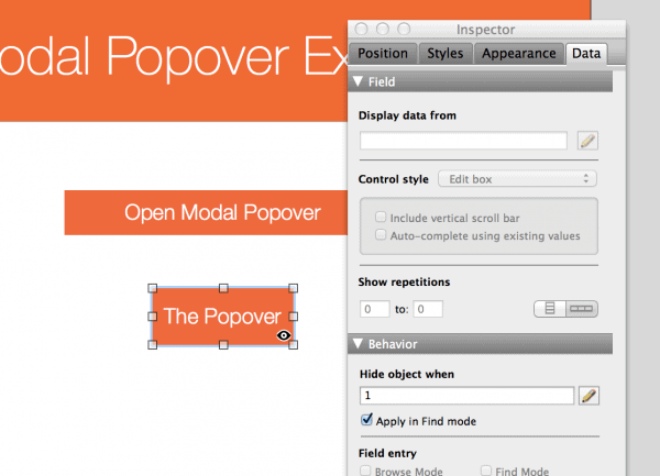
That will allow you to easily access the popover in layout mode, but prevent it from ever being shown to the end user. Despite being hidden, it’s still accessible through the button/script we created.
One last thing to note—you may notice there’s a small gap between the popover and the edge of the window. This is expected behavior. The solution to this involves creating rectangles with the same color/opacity as the popover, and placing them where those gaps are. You can then use the Hide object when feature to only show those gap fillers when the popover is active. This, combined with the methods outlined in the Excelisys article, will create a pretty seamless solution to this problem! As a bonus, I’ve included a demo on the layout ModalPopoverWithGapFill.
**Update**
This blog was updated on June 16, 2016 to adjust the format and supply the missing file link—so thanks, Robert Jackson, for pointing that out to me in your comment!
 The new sample file has also been updated to include Tanya Check’s awesome suggestion, as detailed in her comment below. Thank you for your input, Tanya!
Finally, I’d just like to thank you all for continuing to read my blog. Who knew it would still be generating so much interest a little over a year and a half later? I will be producing FileMaker blogs about once a month, so be sure to subscribe to our FileMaker Community blog if you’d like to receive emailed updates!