As a FileMaker developer, sometimes you inherit projects that were not designed by you, and maybe not designed by a professional developer at all. To me, the most obvious telling sign that a database was designed unprofessionally is inconsistent navigation. Using a system with inconsistent navigation not only shows a degree of unprofessionalism, but it can also hinder performance, and even worse- could strand users on a layout to the point of them needing to restart FileMaker! In this blog, I will talk about some of the standards I use when designing the navigation in databases, as well as point out some mistakes I’ve seen in solutions developed by others.
Manage layouts
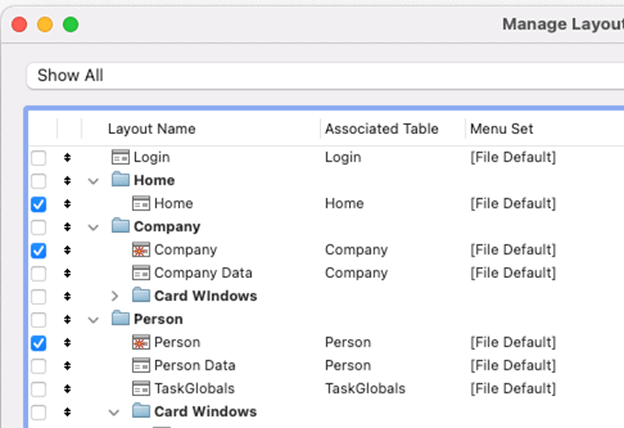
When modifying data via scripts, it is good practice to use layouts that are not user-facing. Doing this will prevent the scripts from being disrupted by script triggers, as well as just improve their performance. Personally, I also use these layouts for testing and development when designing new scripts or debugging problems found. You can quickly change or remove the displayed fields of your development layout without spending time worrying about appearance. That being said, you wouldn’t want a user stumbling upon one of these layouts, so you must make sure the checkbox is empty in the Manage > Layouts dialog box.
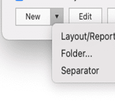
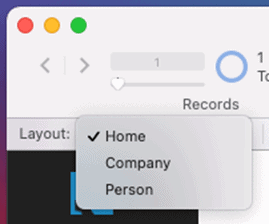
Unchecking layouts will prevent users from being able to navigate to them via the toolbar. I try to keep the number of layouts that are visible in the toolbar very limited- sometimes even none. Doing this, along with other obvious features such as privilege sets, can really enforce the separation between developers and users, which will reduce accidents. However, limiting that number of layouts is a preference, not a golden rule. Within the Manage Layouts dialog, you can organize the visible layouts using folders and separators. This is obviously a very different method than hiding most of the layouts and using navigation buttons the way I am about to dive into, but if organized and desired, this method is totally valid.
Button bars
More often than not, the navigation of my database designs utilizes a button bar as the centerpiece. Once you have chosen the layouts that the user will have access to, you will want to trim that list down even further to decide which layouts you want on the navigation bar. Not all layouts that users are allowed access to need a section on the navigation bar. For example, a layout called “Inspections” based off Inspections could include a portal to store related data, perhaps “Findings”. If all the modification capability and data entry of the related data is provided by the portal, then maybe the navigation bar doesn’t need a section for “Findings”.
Limiting the amount of sections in the main navigation bar can reduce clutter and allow for the user to feel more comfortable navigating around a simplistic system.
Size & position
To create a professional-looking navigation feature, it is critical that every navigation button bar:
- Has the same segments in the same order.
- Is the same exact size, style, and color.
- Is positionally in the same place as each other layout.
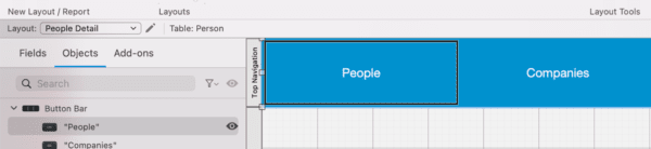
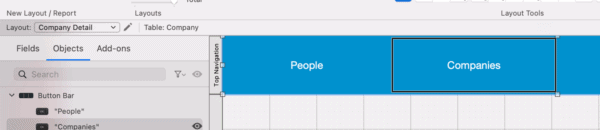
I recommend always putting the navigation bar in the top left corner, whether the bar will run horizontally or vertically across the screen. This will make sure that as long as you follow rules 1 and 2, placing the bar in the same place as others will be easy. Doing this will create seamless transitions when switching layouts- only the active segment will change, the text within the segments will not move.
Generic scripts
Building layouts with these consistencies allows for rapid development without compromising professionalism. The script that accompanies this button bar is no different. Every button can use the same script, then simply map a different parameter for each button to a corresponding if statement. This not only avoids clutter in your script workspace but also creates a script that is easy to change or add to.
Each segment will have its own parameter (which much match the text exactly when using the “=’), but the button bar can simply match the active segment to whichever layout it is placed on.
Make sure you do not direct users to a layout that doesn’t include your master navigation feature. For areas of the database that don’t seem worthy of their own layout with a navigation bar, consider card windows and/or portals. Following these rules and principles will create a standard of work that is easy to replicate and easy to modify while creating a professional, user-friendly interface that will make sense to even a first-time user.